FitSync

A fitness mobile app that helps busy people become motivated by syncing friends' workout schedules
Role:
UX/UI Designer

Duration:
June - Sept 2023

Designed for:
iOS

Responsibilities:
User Research, Wire-framing, Product Design, Prototyping, User Testing

Tools:
Figma, Figjam, Otter.ai, Pen, Paper
An image of multiple phones with FitSync

Overview

Problem

After the COVID-19, many middle aged Canadians struggled to maintain healthy habits, with many feeling unsure with what to do.

How might we motivate middle aged Canadians reach their fitness goals so that they can be healthy?

Solution

A fitness app that syncs friends' schedules and provides workouts to help users be accountable and motivated
Two friends are working out at the gym and a preview of the fitness app is shown on the left

Method to the Madness

I used the Double Diamond Design Process as a way to thoroughly come up with a meaningful solution.
An image depicting the double diamond process of converging and diverging
A torn up paper indicating Step 1

Research and Discovery

Is exercise a concern for middle-aged people?

Being passionate about fitness, my primary objective was to identify the issue. During my research, I came across a concerning trend of decreased physical activity among middle-aged Canadians.
40.5%
of inactive Canadians became less physically active, during the pandemic.

57%
of Canadians, 35-55, say they acted to maintain their routine. A drop from 2020.
33%
of Canadians cancelled their gym memberships.

Asking the right people

I wanted to dig deeper and understand the frustration that the middle-aged demographic were facing, so I conducted three user interviews.
A list of three middle-aged people named Bob, Risa, and Louis
A torn up paper indicating Step 2

Synthesis

What are users saying?

I sorted the data into different pain points, motivators, and behaviours and discovered something interesting.
Pain Points
I'm a father. Finding time to go and workout is pretty tough when you have a baby.
It’s not easy finding someone to workout with because they don’t share the same schedule as me.
We all have families and jobs and stuff that it can be hard to match-up.
I need some way of organizing my schedule with people because finding time is difficult when you're older
Motivators
I'd love to commit more time into it because I want to be there for my kids as long as possible
Having somebody go with me would be super helpful
Behaviours
I go on walks every now and then, but it's not easy to stay motivated when you're alone
I really like tracking every thing I do when it pertains to fitness

Main Theme

"I'm just too busy!" - literally everyone

100% of interviewees agreed that social accountability was important, but the discussion was centered on the the theme of poor time management due to a busy schedule.
Scheduling with a friend
  • Life commitments makes it difficult to find workout times
  • Users are interested in having a workout partner, but can't always match schedules
  • Struggle with organizing time

User Persona and Journey

Understanding the User Joe

Using the data, I created a user persona named "Joe" and followed him on his journey. Analyzing Joe's journey highlighted the importance of syncing one's schedules with one's friends.
An image of the User Persona Joe looking unhappy
An image of Joe's journey of fitness going from disappointed to lazy

HMW Statement

After understanding all this data, it was clear to reframe everything into a question that needed to be answered.
How might we motivate middle aged Canadians reach their fitness goals so that they can be healthy?
A torn up paper indicating Step 3

Ideation

Production goals

After creating my persona, it was time to ideate how to make a digital product that alleviated my persona's core pain points. First, I needed to address the user's concerns.
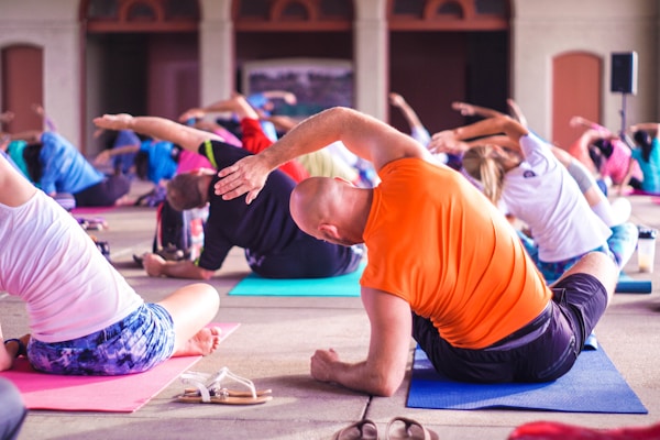
people exercising

Pain Point: Busy schedule

💡 Users can sync personal calendars or create their own  to help you establish workout windows of opportunities
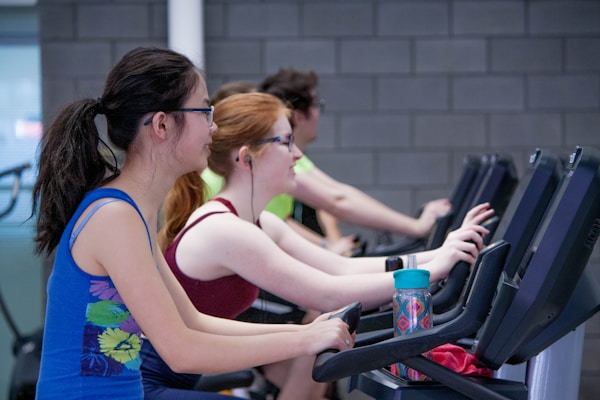
Women exercising on bicycles

Pain Point: Nobody to workout with

💡 Recommend workout partner that matches the user's schedule and categorize by synced contacts and other app users

Task Flow

A tale of two task flows

To help solve the users' frustrations, I used two task flows: one to schedule a workout for the first time and another to match schedules with available friends.
A taskflow chart
A taskflow chart

Ideation

From strategy to design

After finishing the task flow, it was time to come up with solutions. I began the process by creating pen and paper sketches to explore a variety of potential solutions that could be developed into digital wireframes.
An image of wireframe sketches
...which led to the creation of the first iteration of a grayscale digital wireframes.
Images of lo-fi wireframes

User Testing

Test, iterate, repeat

I conducted two rounds of user testing and received feedback from a total of 10 users. After that, I prioritized solutions, and made revisions.

I learned that many of my initial ideas were identified as issues with high impact, so I prioritized fixing those issues.
An image of a design matrix

Revisions

Testing Highlights

Just like one of my favourite games, Pokemon, it was time to change and evolve the app into something stronger. A summary of the changes includes:
  • Improved the usability of the Dashboard by making CTAs clear and having a calendar (*added on the hi-fi version)
  • Include steppers to track progress of booking a workout schedule
  • After selecting a date, the screen scrolls directly to the choosing the time (*time selector options were improved in the hi-fi version).
  • Improved usability of matching with a workout buddy by including more valuable information such as date, time, and if they are currently online
  • Added the ability to chat with a friend and check their availability directly from their profile

Hi-Fi Prototype

Introducing FitSync

FitSync was chosen as the name of the app because it invokes the main idea of the app: to sync your schedule with your friend to reach your fitness goal.

New updates were added as I translated wireframes into High Fidelity. I added a calendar on the dashboard, the send request hierarchy was fixed, and events were added to remind users what other appointments they had on their calendars.
Images of multiple hi-fi wireframes
An image of torn paper indicating the conclusion

Takeaways

Results

I was able to use the double-diamond process to create a concept that would help middle age people connect with their friends to workout. I mastered using Figma and utilized many UX techniques such as personas, user flows, and usability testing.

Next steps

If I were to continue this project, I would further explore the functionality of matching with strangers instead of friends.

What I learned

📋 Importance of testing. Testing with the target audience helped emphasize the impact that my idea could have.

🕵️ Focus on the problem. Not the solution. Anyone can think of a solution, but taking the time to truly consider a user's needs before taking action is more important.

Thank you! 🙏

More Projects

An image of a computer surrounded by buttons

Christina Translates

An image of a computer surrounded by buttons

Sentry

Back to top